STATIC DISCLAIMER: All the stuff in here is purely my opinions, and they tend to change depending on what mood I'm in. If you're going to get bitter if I say something about you that you don't like, then maybe don't read. I avoid using names as much as possible, and would request that people who know me do the same in their comments. Basically, I often vent my frustrations on here, so if you happen to be someone who frustrates me, expect to read a description of someone very much like you in here!

Monday, July 24, 2006

Interface Design

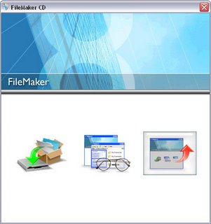
Pop a copy of Filemaker Pro 8 in your CD drive, and you'll be presented with the following screen:


Now, these buttons don't have tooltips or text labels. So you tell me - what do they do? Now, one assumes that the first button will be "install" and so that makes guessing that one pretty easy. But what about the other two? Without some substantial pondering, their purpose is about as clear as Turkish coffee.

Yay for form over function!

1 comment:

Monkeytree said...

Totally. A UI should have words accompanying the images, for clarity.

I'd guess the options are:
1. Install
2. Meditate upon what has been installed
3. Transcend program to higher plane of existance

It's a three step process for enlightening your mac.